Cover art: the good, the bad, and the WTF
-
Let's talk cover art!
I'm one of those people who absolutely does not believe in the whole ''Don't judge a book by its cover'' thing. Good art direction can make a huge difference in making a release feel like a cohesive aesthetic whole. VK has had its fair share of absolute bangers and unsightly eyesores, so here's a place to talk about some of your favorites and least favorites.
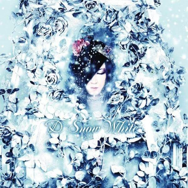
I personally REALLY like this series of vinyl-only singles released by Guruguru Eigakan:
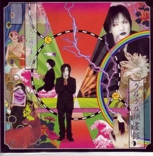
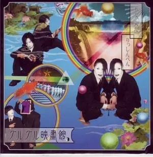
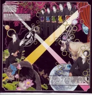
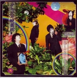
They really nailed the vaguely Tadanori Yokoo-esque retro/psychedelic/surrealist aesthetic with these ones. Honestly a perfect embodiment of their sound. -
guruguru eigakan are so unique! i love seeing covers with overwhelming amount of color lol. some of my personal favorites would be covers with art 100%. some i can think of right now are:

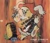


fun fact, ride an angel’s hair (middle) got drawn by an acquaintance of Euro’s at the time iirc. he wrote the last album’s song inspired by it
ah wow the rescaling really failed here
-
Let's talk cover art!
I'm one of those people who absolutely does not believe in the whole ''Don't judge a book by its cover'' thing. Good art direction can make a huge difference in making a release feel like a cohesive aesthetic whole. VK has had its fair share of absolute bangers and unsightly eyesores, so here's a place to talk about some of your favorites and least favorites.
I personally REALLY like this series of vinyl-only singles released by Guruguru Eigakan:
They really nailed the vaguely Tadanori Yokoo-esque retro/psychedelic/surrealist aesthetic with these ones. Honestly a perfect embodiment of their sound.@Tokage Oh these rock! I love them! I have never seen these before. Come to think of it, Inugami Circus Dan has a couple Yokoo style covers for some of their releases.
I'm generally so-so about most vkei album covers. The only ones that stand out to me from memory are the Suehire Maruou covers they did for Merry and the ones that Yamato Takato has done for Kyo and Dir en grey. Also early Kagerou releases I like the covers.
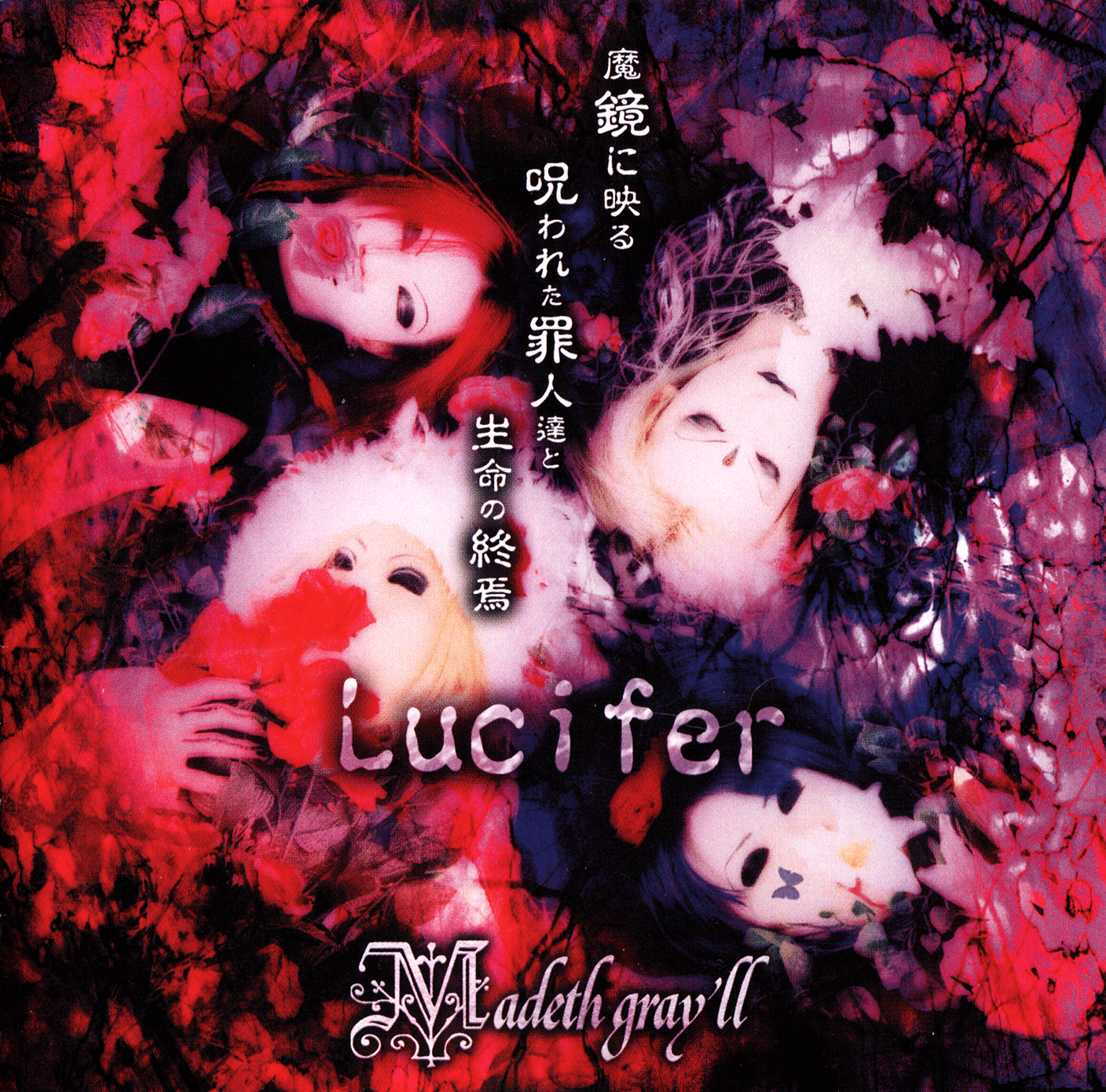
Also shout out to my homies sleeping in a big circle or in a pile of flowers
-
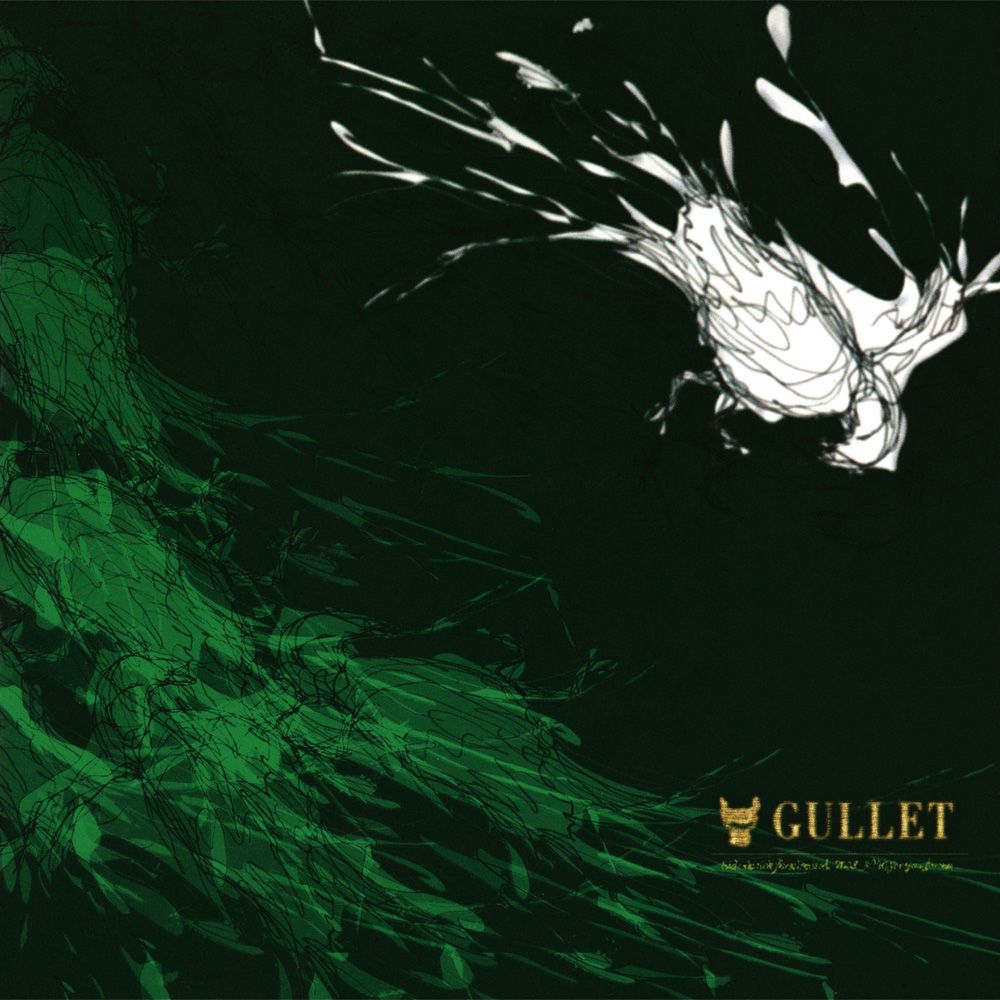
GULLET's covers (aside from their debut single) were apparently all hand-drawn by ryo and they look awesome IMO.
-
GULLET's covers (aside from their debut single) were apparently all hand-drawn by ryo and they look awesome IMO.
-
@omochadorei Wasn't there some kind of alleged plagiarism scandle surrounding the first gullet single, or am I mixing up my bands here?

@Tokage Yeah, I think I remember seeing something about how the photo was "appropriated" from a Japanese photographer. Looked it up real quick and this was the exhibition: https://kobayashi-shinichiro.com/photo_gallery/haikyo-yugi.html
I just checked my Desert scans and ryo is credited for "art works" on that release as well... no photographer named. With that in mind it does honestly draw the other covers into question, but hey, they still look awesome

-
GULLET's covers (aside from their debut single) were apparently all hand-drawn by ryo and they look awesome IMO.
@omochadorei I LOVE the see-through CDs those come with too omg, they pair with eachother soooo nicely. Hidden Baby too... I love them... I also hadn't heard about that scandal, that's so neat (in a... neutral way? Cool to see the inspo, but...hm...)
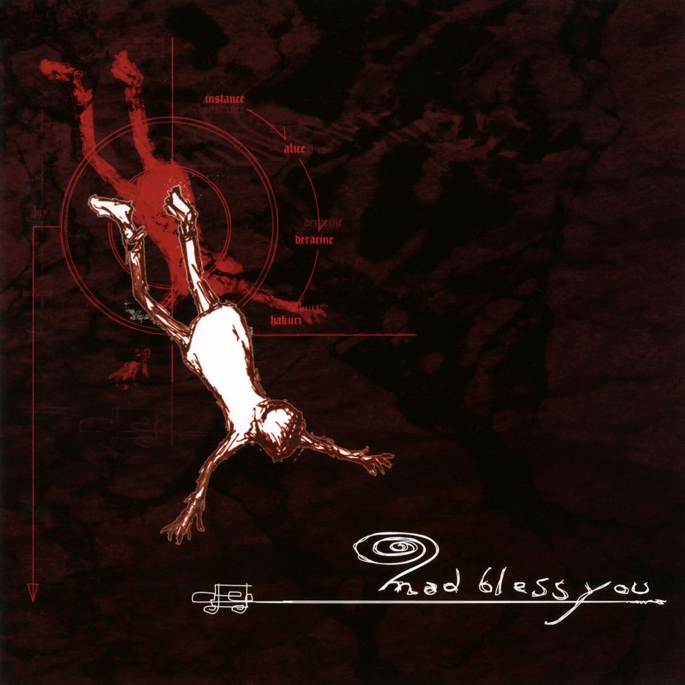
Now for album covers I love... I just can't help myself from talking about kein. I love the covers for mourou no mi and hakai to souzou SO much...
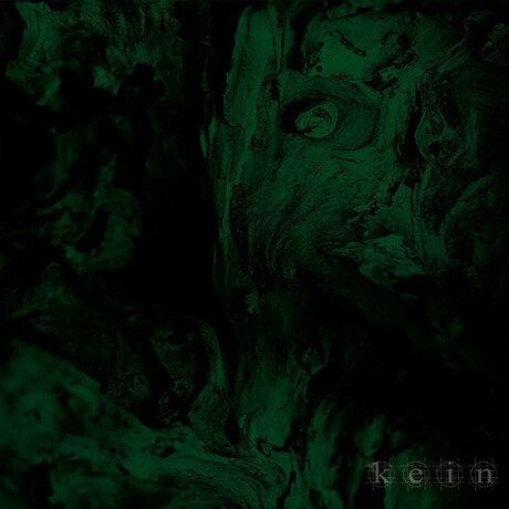
Something super cool about these that you don't get from just looking at pics... the actual covers are in black-and-white, and the color comes from the cases. For mourou no mi, the jewel case itself is bright red, & for Hakai to Souzou, the limited edition just comes with a green slip-cover, so not exactly done the same, but still...
I think it's so cool that they share this quirk, with mourou no mi being their last release before they broke up and hakai to souzou being their first album after getting back together. I feel like it really ties them together... plus, it means you get to do fun stuff like this.
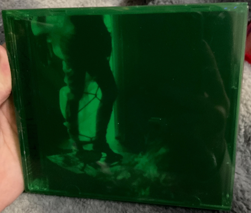
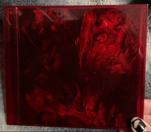
yahahahaaa!!
**edit, not to mention... red/green combo, my two fav colors & evidently a lot of nagoya bands' favs as well.... even those GULLET singles have that going for them.... LOOVE it....
-
@omochadorei I LOVE the see-through CDs those come with too omg, they pair with eachother soooo nicely. Hidden Baby too... I love them... I also hadn't heard about that scandal, that's so neat (in a... neutral way? Cool to see the inspo, but...hm...)
Now for album covers I love... I just can't help myself from talking about kein. I love the covers for mourou no mi and hakai to souzou SO much...
Something super cool about these that you don't get from just looking at pics... the actual covers are in black-and-white, and the color comes from the cases. For mourou no mi, the jewel case itself is bright red, & for Hakai to Souzou, the limited edition just comes with a green slip-cover, so not exactly done the same, but still...
I think it's so cool that they share this quirk, with mourou no mi being their last release before they broke up and hakai to souzou being their first album after getting back together. I feel like it really ties them together... plus, it means you get to do fun stuff like this.
yahahahaaa!!
**edit, not to mention... red/green combo, my two fav colors & evidently a lot of nagoya bands' favs as well.... even those GULLET singles have that going for them.... LOOVE it....
@brainimpediment Wow, the forbidden color swap...
I love those colored jewel cases, not many bands have that. Right off the top of my head, the only other vkei act I can think of is Eliphas Levi who had a light-blue tinted one for one of their minis (冷たいアトリエの魔術師). Oh, and almost forgot to mention, it has a neat "layered" booklet with semi-transparent pages that project layers of images on top of each other (it's a bit hard to explain and I don't have my copy with me here to show orz).
-
Just to drop an example of what I consider BAD cover art, I think The Gallo pretty consistently have rather ugly cover art. Just some examples:
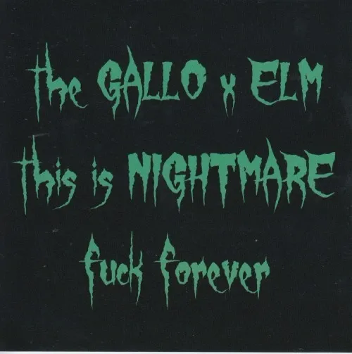
For "worst", I think this has to be my pick...
-
@brainimpediment Wow, the forbidden color swap...
I love those colored jewel cases, not many bands have that. Right off the top of my head, the only other vkei act I can think of is Eliphas Levi who had a light-blue tinted one for one of their minis (冷たいアトリエの魔術師). Oh, and almost forgot to mention, it has a neat "layered" booklet with semi-transparent pages that project layers of images on top of each other (it's a bit hard to explain and I don't have my copy with me here to show orz).
@Jigsaw I've got two cali≠gari with tinted cases (Doukei, Suiren to Himawari regular press is blue and also scented and Haru no Hi CD-ban is pink) and Macabre is smokey grey.
I don't always love cali≠gari's covers (the photos of Shuuji with the cake for the 15 digital singles, I think the album art for 16/17 is much weaker than the singles and supplementary material), but Ao ALWAYS turns it out in packaging design and materials.
-
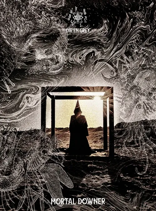
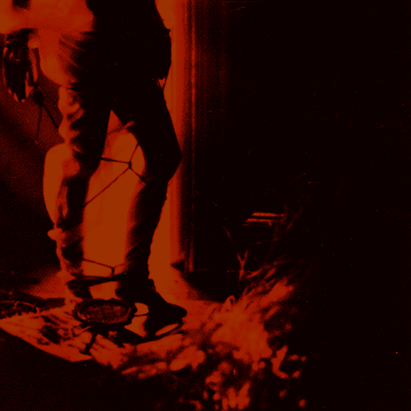
A strong, fresh contender from 2026.
A man in a KKK hood is standing inside frames that make up a box-like shape in a desert. He's not getting out of the box, despite that there's nothing stopping him, he's just standing there and reflecting. What's he thinking about? What's does the box symbolize: society, ideology, mortality, about something being a downer, big thoughts as indicated by the overlay of insects, goats and galactic shapes kind of like the big science brain POV shots from Oppenheimer.
Abysmal and tacky cover. They've had some shit before but this is just beyond the pale for me personally
-
A strong, fresh contender from 2026.
A man in a KKK hood is standing inside frames that make up a box-like shape in a desert. He's not getting out of the box, despite that there's nothing stopping him, he's just standing there and reflecting. What's he thinking about? What's does the box symbolize: society, ideology, mortality, about something being a downer, big thoughts as indicated by the overlay of insects, goats and galactic shapes kind of like the big science brain POV shots from Oppenheimer.
Abysmal and tacky cover. They've had some shit before but this is just beyond the pale for me personally
@disposable Simultaneously screams "edgy 2010s indies br00tal kei band's first attempt at graphic design" and "bootleg avantgarde black metal cover made by the guitarist's girlfriend's kid brother with freeware graphics software".
-
A strong, fresh contender from 2026.
A man in a KKK hood is standing inside frames that make up a box-like shape in a desert. He's not getting out of the box, despite that there's nothing stopping him, he's just standing there and reflecting. What's he thinking about? What's does the box symbolize: society, ideology, mortality, about something being a downer, big thoughts as indicated by the overlay of insects, goats and galactic shapes kind of like the big science brain POV shots from Oppenheimer.
Abysmal and tacky cover. They've had some shit before but this is just beyond the pale for me personally
@disposable The font choice kind of makes me angry in a way I can't quite explain.


Hello! It looks like you're interested in this conversation, but you don't have an account yet.
Getting fed up of having to scroll through the same posts each visit? When you register for an account, you'll always come back to exactly where you were before, and choose to be notified of new replies (either via email, or push notification). You'll also be able to save bookmarks and upvote posts to show your appreciation to other community members.
With your input, this post could be even better 💗
Register Login